3.4 PerformancePoint Content
With a connection set up and ready to go, we can move
on and take a look at creating our first dashboard using
PerformancePoint. Before jumping into this, however, you’ll find it
worthwhile to develop an understanding of how everything hangs together
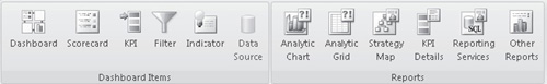
behind the scenes. Select the PerformancePoint Content folder that we
created earlier, and then click the Create tab in the ribbon. This time,
you’ll see a much wider range of options, as shown next:
Dashboards are essentially a collection of web pages.
As mentioned earlier, PerformancePoint dashboards are made up of web
parts, which are discussed in the following sections.
3.5 PerformancePoint Filter
When the Filter item is added to a dashboard from the
Dashboard Items section of the ribbon, behind the scenes the
PerformancePoint Filter web part is added to the underlying page. As
you’ll see, the Filter control can be used to filter other elements on
the page.
3.6 PerformancePoint Report
The PerformancePoint Report web part does most of the
heavy lifting within a dashboard. Whenever a report is added to a
dashboard, behind the scenes a PerformancePoint Report web part is added
to the underlying page. This means that each of the options available
from the Reports section of the ribbon are implemented using a
PerformancePoint Report web part.
3.7 PerformancePoint Scorecard
Scorecards are implemented using a specific web part.
Scorecards work in a similar fashion to the Status List web part
discussed earlier. The major difference is that PerformancePoint
scorecards are managed by the PerformancePoint Service Application, as
opposed to being rendered from a SharePoint list.
3.8 PerformancePoint Stack Selector
The
PerformancePoint stack selector web part is used to provide a navigation
mechanism between the dashboard pages. When creating a dashboard, the
Stack Selector is added automatically.
3.9 Create a Dashboard
Now that you know how PerformancePoint weaves its magic, let’s create a simple dashboard:
From the Dashboard Items section, click Dashboard to add a new dashboard to the workspace.
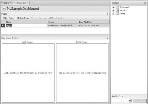
From the Select a Dashboard Page Template dialog, select the 2 Columns template.
Type the name of the dashboard as MySampleDashboard.
In
the Series box, click the Product Categories drop-down. When the Select
Members dialog appears, uncheck the Default Member (All products)
checkbox, and then expand the All Products branch and select
Accessories, Bikes, Clothing, and Components.
You
can see in the editor that three sections are shown. The top section
allows you to add additional pages to the dashboard, and the bottom
section represents the dashboard content and contains two columns, as
shown next, because we selected the 2 Columns template. We can add
content to the Dashboard Content section by dropping the appropriate
item from the Details section on the right side of the page. Of course,
before we do this, we’ll need to create some content to add!
From
the Reports section of the ribbon, click Analytic Chart. In the Select a
Data Source step of the wizard, select the AdventureWorksOLAP data
source and then click Finish.
Type the name of the new report as MyChartReport.
You’ll see the Analytic Chart designer interface. To create a chart,
you can drag measures, dimensions, or named sets from the Details
section on the right side of the page onto the design interface.
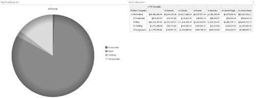
Drag the Product dimension into the Series section and the Date dimension into the Bottom Axis section.
Rather
than displaying our data using the default bar chart, change the layout
to Pie Chart by right-clicking anywhere on the chart and selecting
Report Type | Pie Chart.
Save the finished report, and then switch back to MySampleDashboard.
Drag
the finished report onto the dashboard. Under the Reports heading in
the Details pane, drag MyChartReport onto the left column of the
dashboard.
The next thing we need to add is some content for the
right column. This time, we’ll use an Analytic Grid report to allow
users to examine the details that make up the chart.
As
before, click the Analytic Grid icon in the Reports section of the
ribbon. Select the AdventureWorksOLAP data source, and then name the
report MyGridReport.
This
time we want to show a bit more detail. Drag the Product dimension into
the Rows section, the Geography dimension into the Columns section, and
the Date dimension into the Background section. Save the completed
report, and then add it to the right column of the dashboard.
Now
that our sample dashboard is populated, we can publish it to SharePoint
to see the finished result. Right-click MySampleDashboard, and then
select Deploy to SharePoint.
Once the dashboard has been deployed, it will automatically be opened in a new browser window and will look similar to this: